Which age group do you fit into?
Wednesday, 24 November 2010
Digital mock-up using found images
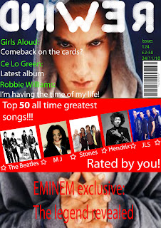
This is my mock-up of my front page put together using images I collected from the Internet. This layout is very similar to look I want to achieve when creating my own front page for a music magazine. I used the banner headline to attract customers to the magazine with it being red and very eye-catching as well as having big text which is easily visible and you can't help but look at it. I used this medium close up of the rapper Eminem because not only is he one of my favourite artists he fits into the genre of music my magazine is about. The medium close up shows the artists face and makes the reader feel as though they are stood looking at him and able to see his facial expressions. All the text apart from the story about an interview is in green and white to give the magazine a consistent house-style which would be carried out throughout the magazine with all text being this colour. I have used green for the artists name and white for further information because it is easy to recognise who the story is about(green) and what the story is about(white). The name of the magazine along the top of the magazine was made by me on photoshop using the brush tool with free hand. I made the title myself because I couldn't find a way to make the text look reversed as though it's in 'rewind'. The interview headline is at the bottom of the page to draw more attention to the interview because it's isolated from the rest of the text. Looking back at making this magazine, when I create my own music magazine using my taken images I will move the title a little to the left to leave less of a gap and I will fill more of the space at the bottom by either using more cover lines or putting a different image there. The bar code I have used is just an image I collected off google off an existing bar code and I further added a price, date and issue number. I chose a random number as the issue date that was over one hundred because it shows that the magazine sells well and gives the impression that it's a good magazine. I put the date the same as the current date (when I made it). The price I set was £2.50 because I think this is a reasonable price for this magazine and would attract my target audience as it is affordable. I used the strap line 'Rated by you' to show the audience that the magazine is made for their requirements and contains what other readers think or like to read. It gives the audience a simple statement that the public have rated songs based on their opinion of them and have been generated into a list of the 'Top 50 songs of all time'. My front cover is also used as a representation of my music genre that it's not what people typically think and can be opened up to everyone who enjoys music through neutral colours not associated with just boys or girls. I tried to keep an organised looking layout to maintain a professional look to the magazine. I also used a headline to attract readers to my main story which is the exclusive interview with Eminem. I used the word exclusive to show that only this magazine managed to get the interview with Eminem to promote the status of the magazine with this scoop.
Subscribe to:
Post Comments (Atom)

Callum,
ReplyDeleteThe digital mock up with found images is really useful and gives a good idea of how you intend to arrange your layout etc.
However, you've skipped through the following steps from the checklist (which are crucial to securing the 20 marks for planning and research):
2. LIIAR interpretation of the brief:
3. Identify and explain choice of music genre.
4. Market research into 3 existing magazines using LIIAR:
- Front page
- Contents pages
- Double page features
5. Target audience
6. Price / how often published etc and why?
*7. Initial ideas based on your market research.
Make sure that you're working at around steps 6 / 7 by the end of this week if at all possible.