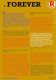
On this version I have changed my banner headline into a central piece of text which stands out equally as well but looks more prominent and professional in the middle of the page. By doing this it also grabs reader's attention and makes the reader aware of the main article to follow. I kept the bottom half of the page the same as I like the layout and style of it, I slightly altered the 'WIN!' section to make it shorter and snappier to customers passing by. I cut down the size of the 'Gerard' text to make that also stand out more but not enough to take focus away from the main story. I included some real artists names to make the magazine appear more high profile as they are able to get these famous artists on the magazine.
I changed the heading from 'Rags to riches' to 'The man that changed music. FOREVER.' to add more impact on the main story and make it sound more appealing. My target audience can relate to these types of clothes I am wearing as they would usually be seen wearing similar clothes from similar brands. I used one full page for pictures to add greater focus on the artist this is about and to allow this audience to relate to his image outside of work.
This article is improved a lot from my previous drafts as I got rid of the pull quote in a gold circular background. I changed it for a pull quote within the text and singled out by using a different colour font. This looks more professional and ties in with the conventions of a music magazine. I also put the magazines emblem in the corner as it promotes the magazine and makes reader's aware of the magazine they are reading. I also made the text smaller so I could fit more into the article and changed a few of the font colours to suit my tastes. I used a drop cap for the first paragraph to follow conventions of most magazines I researched. I used different coloured fonts to allow the reader to differentiate between speakers.


No comments:
Post a Comment