Which age group do you fit into?

Friday, 17 December 2010

Article drafts

final draft of my article with all amended errors. I came to this final version after going through it three times and making it look as professional as i could.


This is my second draft with some amended spelling and punctuation. I altered this after giving it to a friend to check.


This is my first draft which I did late at night which shows with some sloppy errors which I need to amend as well as including capitals for proper grammar.


Article draft


This is page 2 of my double page spread containing the article, a strap line and quote. The other page of my article is of a photo and the title 'FROM BOYS TO MEN' which is in the font style from dafont.com i previously uploaded.

Thursday, 16 December 2010

Analysis of magazines

Kerrang!

 Front cover:


Language- The main image on this page is a long shot where the featured artist takes up as much room as possible on the front page and cuts across part of the masthead and synergy. All the images on the front cover are in colour with no editing to the content of the photo. This shows the artists/bands for how they are to allow the audience to interpret the photos as they want. The genre of music this magazine represents is rock/metal which is why the denotation of the main image is of a man with his face half painted with a sword in his hand. People usually expect an aggressive style of music from metal artists which is why 'BIFFY CLYRO' is holding a sword which also links in with the strap line to go with the banner head of the artist featured. This image matches readers expectation of music from this genre by showing a fairly heavily tattooed man with no shirt and a sword with half a face painted. These help stereotype this artist to his music genre because you wouldn't see a current chart music artist being represented as aggressive because more media attention is focused around them than this genre of music which would generate negative press for their genre of music. The two medium close ups of artists in the free calendar is a synergy to promote not only the two artists who are in the photos but to promote the magazine as a whole because they are giving away this magazine with pictures of music artists inside which is done at once through one image which helps to sell the magazine.All the text on this page is in capitals to further enhance the idea of an aggressive music genre written as though it's being shouted at you as some people say metal music is sung. A white, red and black colour scheme is maintained throughout to create a house-style which is recognisable to this magazine. Other conventions used on this page of the magazine include the bar code typically in the bottom right hand corner with an issue number and date, a price and the website. I t also has a few sell lines across the top of the page above the masthead to help entice readers to pick up the magazine. All other cover lines are at the bottom of the page to add the effect of not only what's enlarged through text and image size and positioning but more stories than what's shown of this busy, action-packed front cover. The masthead of this magazine is the largest font to draw attention to the name of the magazine to help readers remember it and has cracks in the font as though something's hit it which also links to the idea of the aggressive artists on the front cover with swords and angry faces. The idea of it being hit is also shown through the masthead looking chipped in places with bits of the colour out of letters missing to look like something's moved it. This front cover is cleverly laid out to not overwhelm readers at once but to draw attention to main parts of the cover first through font sizes and image sizes. This is orderly done whilst maintaining a busy and action-packed look. This aggressive nature of this music genre is shown again with a ripped effect on the edges of the calendar gift photo which looks like it's been ripped out and stuck onto the front cover. 


Institution- Bauer Media produce Kerrang on a weekly basis with it being globally recognised as the world's largest weekly selling music magazine.


Ideology & Audience-  Kerrang's audience is metal/rock lovers who listen on T.V and radio as well as reading their beloved magazine. Their audience are generally experienced with music and are loyal and passionate to and about their genre of music. Throughout the magazine an aggressive and violent atmosphere is created to give the idea that the artists from this genre are as passionate about music as the readers which helps them relate to the magazine because they feel they are reading about people similar to themselves. This magazine also shows metal/rock singers to show their passion for their music through actions and appearances.
http://www.bauermedia.co.uk/Brands/Kerrang/

Representation- The genre of music this magazine represents is rock/metal which is why the denotation of the main image is of a man with his face half painted with a sword in his hand. People usually expect an aggressive style of music from metal artists which is why 'BIFFY CLYRO' is holding a sword. This genre of music is represented through stereotypes such as Biffy on the front cover who is wielding an aggressive weapon and has many tattoos which are shown off by not wearing a top. This gives the readers the instant idea that the genre of music being displayed is hardcore rock/metal where everyone is passionate about their music. 


 Contents:


Language- The images on this page vary and all give a different aspect of the genre it's displaying. The woman in the bottom left hand corner picture is of the magazine editor who has written a piece about the magazine to give the readers a feeling of involvement because they feel as though they are involved by hearing from a main character in their favourite magazines production. The house style remains the same as the front page n this page keeping consistency. The wide shot image across the top half of the contents page is from a gig and gives the reader the perspective of the artist and makes you feel like your on stage with them making the artist seem welcoming as though they have let you on stage with them to do a gig. The image closest to the bottom of a male in a tank top looks like someone from the Rolling Stones in their prime who is enjoying playing their guitar. We are given a birds eye view of this artist as though we are looking down on him because the cover line to this story is 'Airbourne' and gives the reader a sense of floating above the featured artist. The head of this page is clear and visible but doesn't take much room up because it want's the reader to feel engaged with the '30 Seconds To Mars' gig which can only have an impact if it's an eye-catching image. Another typical convention on this contents page is the puff trying to get more subscribers to the magazine in the bottom right corner of the page which is a standard convention seen throughout many contents pages. All the text is again in capitals which adds to the expected aggressive nature of music in the magazine. It is a different layout where the main story is blown up as a background for the page head and the information about other stories is below under a clear divide to show the main story and the rest. All the font is easy to read and a pretty standard font style used in all the cover lines and strap lines in the bottom half of this page. This front page has no gimmicks and shows this genre of music how it is because their readers love this genre of music and are loyal to it for what it is.


Institution- Bauer Media produce Kerrang on a weekly basis with it being globally recognised as the world's largest weekly selling music magazine.

Ideology & Audience-  Kerrang's audience is metal/rock lovers who listen on T.V and radio as well as reading their beloved magazine. Their audience are generally experienced with music and are loyal and passionate to and about their genre of music. Throughout the magazine an aggressive and violent atmosphere is created to give the idea that the artists from this genre are as passionate about music as the readers which helps them relate to the magazine because they feel they are reading about people similar to themselves. This magazine also shows metal/rock singers to show their passion for their music through actions and appearances.
http://www.bauermedia.co.uk/Brands/Kerrang/

Representation- The image closest to the bottom of a male in a tank top looks like someone from the Rolling Stones in their prime who is enjoying playing their guitar. This reflects the audiences genuine love for the music for whom the majority have musical experience of some kind. This shows how successful artists are just the same as the readers in their love for this style of music. The representation of the main image at a gig is that all the readers can go and see their hero's from the magazine at gig's if they want to get further involved with their favourite bands and it says that they can see their music idols in person.


Double page spread:


Language- The layout of this double page is the same as the contents page with the big image at the top half of the page with the text below and a head to the page/story enlarged to show the importance of it. The house style is again kept for consistency with the main text being all white and highlighted names or parts of speech in black or red to make it stand out aside from the interview/article. On the right hand side of the page a red blood splat shaped object is used as a text box for a quote whilst maintaining the typical aggressive theme for this genre of music. It is used to also indicate the blood splat is from the kill he band has gone in for in the headline of the story. Their is also a small caption on the photo to explain who is in it to help the readers establish an understanding of the text. The only image on these pages is a wide shot spread across both pages to get the readers full attention to the image of who the text is about to raise awareness of this band's image. All the band members are also wearing black which makes them look smart whilst the connotation of this colour shows what genre of music they are from because people link to this genre of musci as being dark and Gothic-like where black is commonly worn.


Institution- Bauer Media produce Kerrang on a weekly basis with it being globally recognised as the world's largest weekly selling music magazine.

Ideology & Audience-  Kerrang's audience is metal/rock lovers who listen on T.V and radio as well as reading their beloved magazine. Their audience are generally experienced with music and are loyal and passionate to and about their genre of music. Throughout the magazine an aggressive and violent atmosphere is created to give the idea that the artists from this genre are as passionate about music as the readers which helps them relate to the magazine because they feel they are reading about people similar to themselves. This magazine also shows metal/rock singers to show their passion for their music through actions and appearances.


Representation- The band in this image are all wearing smart/casual clothing which suggests they are just normal members of the public off stage and blend in because of the lack of media attention in the news etc. of metal/rock stars and this interview will raise awareness of their band. All the band members are posing in one way or another in this photo which suggests they are up for a laugh and again links them to their audience as being the same off stage as you and me.

Analysis of magazine

NME

 Front cover:


Language- The image used on the front page of this magazine is a close up which has the denotation of John Lennon smoking whilst looking directly at the camera. This close up image needs no background or setting as John Lennon is known worldwide as an iconic figure of the 60's from The Beatles. The close up image of Lennon allows this photo to sum up people's attitudes in the 60's when he influenced everyone around him. It also uses him to represent the era he is from because to this day he is known globally. With John Lennon being such a powerful character especially for a front page the layout is simple with little text and draws no attention away from the image of him. This image makes people want to pick up this magazine because people know about him being an activist as well as a singer/songwriter. When people are as famous as he is they want to know more about the artist to be able to gain knowledge of him, the era he's from and the music he so heavily influenced. The photo is also in black and white which shows he is dead via the connotations of the colour black and white with the strap line to his headline in red to connote blood which is also associated to death which tells the reader he is dead and that the magazine pays tribute to him and looks back at him. Its also in black and white to show that this is a past photo back when colour cameras where not around. The black and white colour of the photo is used throughout the magazine to create a house-style similar to a newspaper which appeals to its target audience. The masthead and sell lines in the '+' section add to the idea of the magazine being organised and constructed around the main image with text placed to fit any gaps around the photo.The bar code and masthead aren't instantly recognisable as they are tucked away in the corners in colours which blend into the John Lennon photo. The colour of the masthead and page border link into the idea of a 30th anniversary which has a silver colour scheme which further links to the 30th anniversary of Lennon's death shown in the sell line and slogan colour in the magazine.


Institution- The IPC media company produce the NME magazine on a weekly basis costing £2.30. They are a well known publication company. Their websites in total reach 14 million+  users every month.two thirds of women in the UK alone read a media print from the IPC media company and 42% of men in the UK totalling almost 26 million adults in the UK. The IPC was set up in 1965.  
http://www.ipcmedia.com/


Ideology & Audience- This magazine targets mainly male readers with 74% of it's reader's being male who all believe this magazine is factual and keeps them in touch with the music which they love. Surveys have shown that this magazines audience watch a lot of films, have mobiles which perhaps means this magazine is to keep them updated with music as thye lead busy lifestyles and this magazine is their only way of staying in touch with what they love (music). This magazine was produced to inform readers of what is happening in the music world and to give them some history lessons within music to give them more knowledge week by week of their main passion. This is down to their 'Honest no-holds barred reviews' which represent the featured artists in a way which the audience can relate to.
http://www.ipcadvertising.com/resource/hvcjivb3x8p8oqk9bw285ffu.pdf


Representation- This image represents the era of music which John Lennon was from when everyone used to smoke because awareness of smoking's harmful effects was very low and in this hippy era when no one cared and had no regards for what happened next in life and took life in their stride which is shown here with John Lennon looking at the camera as though he's not bothered what people think or say.


 Contents page:


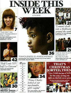
Language- All the pictures in this contents page are some form of close up except the John Lennon related one which shows a long shot of his followers. This helps convey emotion in the picture expressed by the band/artist. All the font on this page is in black and the background is white which is a simple layout with all the stories having a cover line with a quote underneath them to help attract readers to the stories to help them instantly get a feel for the story. All the font styles are plain and easy to understand with no fancy flicks. The only time this institution deviate away from this all plain layout is a few italic cover lines which draw more attention to them as they look different to the rest of the page. The head of the page is also simple and has the look of a newspaper the way it is laid out. This layout gives people the idea it is for review loving people as they are generally thought to be the ones who buy newspapers and enjoy the content rather than extravagant colours and fonts. Each different story on this page has it's own box to separate them from one another. The only other convention used on this page is  a puff to promote the magazine which you are reading to try and get reader's to subscribe.


Institution- The IPC media company produce the NME magazine on a weekly basis costing £2.30. They are a well known publication company. Their websites in total reach 14 million+  users every month.two thirds of women in the UK alone read a media print from the IPC media company and 42% of men in the UK totalling almost 26 million adults in the UK. The IPC was set up in 1965.  

Ideology & Audience- This magazine targets mainly male readers with 74% of it's reader's being male who all believe this magazine is factual and keeps them in touch with the music which they love. Surveys have shown that this magazines audience watch a lot of films, have mobiles which perhaps means this magazine is to keep them updated with music as they lead busy lifestyles and this magazine is their only way of staying in touch with what they love (music). This magazine was produced to inform readers of what is happening in the music world and to give them some history lessons within music to give them more knowledge week by week of their main passion. This is down to their 'Honest no-holds barred reviews' which represent the featured artists in a way which the audience can relate to.

Representation - All the pictures show how the people shown in this magazine really are and show the different sides to music and how it affects people in different ways. This representation helps the audience to relate to the people on the magazine because it shows them on and off stage. All these photos also tie in with what their target audience expect from their magazine which is honest and factual information therefore they represent all the artists as un-biastly as they can.


Double page spread:


Language- This main photo (right) is of a young artist in a mid shot. It's in colour to show it's recent and up to date to give readers the impression they are getting knowledge of past and present artists to keep up with the music industry. The smaller picture on the left hand side of this double page spread is of the featured artist with her family who all also happen to be famous. This picture shows her family although all famous to have not lost their family spirit as they are all smiling and look like they are having a good time. This represents music on a whole to be welcomed by all ages, races and genders. This photo is also in colour to show the reality of this situation and show their family in a positive light. The immediate connotation of a red carpet is fame and spotlight which shows how music artists live their life whether a family or not because they all come under the same spotlight. This image is a long shot where the featured artists family are all in focus to show equal importance. The text on this double page spread is very similar to what you would expect to see in a newspaper with all black and white font except the gold part of the heading which gives the reader the idea of wealth now she's become famous as the world today revolves around money and wealth to separate classes of people. The style of the article is also very similar to that of a newspaper because it introduces the story then gives you the background before interviewing the artist and then giving their interpretation of their answers after every question and answer. The head to the story is in bold with a sense of street slang to give the idea of what kind of music she in involved with. The word 'FRESH' on the streets means new and original as well as being a good singer in this case. It helps us readers relate to modern slang and understand the featured artist. This page also contains a quote form the artist which sums up the story called a strap line and draws readers to the story. This is in a black circle in between the main body of the text to catch more attention. NME also include a gold strip with a mini questions and answers section to really get the reader involved with the featured artist by telling us their favourite things which help us relate to her by thinking we know about a big music star.


Institution- The IPC media company produce the NME magazine on a weekly basis costing £2.30. They are a well known publication company. Their websites in total reach 14 million+  users every month.two thirds of women in the UK alone read a media print from the IPC media company and 42% of men in the UK totalling almost 26 million adults in the UK. The IPC was set up in 1965.  

Ideology & Audience- This magazine targets mainly male readers with 74% of it's reader's being male who all believe this magazine is factual and keeps them in touch with the music which they love. Surveys have shown that this magazines audience watch a lot of films, have mobiles which perhaps means this magazine is to keep them updated with music as they lead busy lifestyles and this magazine is their only way of staying in touch with what they love (music). This magazine was produced to inform readers of what is happening in the music world and to give them some history lessons within music to give them more knowledge week by week of their main passion. This is down to their 'Honest no-holds barred reviews' which represent the featured artists in a way which the audience can relate to.

Representation-The featured artist is in focus to show she is the main person on the street whereas the fans in the background are out of focus to show they aren't as important and aren't the focus of this article. However, the denotation of this picture is that the artist is walking the streets the same as you and I which shows she doesn't think she is above her fans and hasn't let fame take over her personality. The featured artist is also wearing a 'different' type of clothing to what you would expect a new music star to be wearing which represents the kind of clothing style someone like Lady Gaga would wear who is an individual kind of person recognised for her individuality in clothing preferences. This is different to the normal expectation of a pop star who wears designer, fashionable clothing to endorse brands.

Font styles

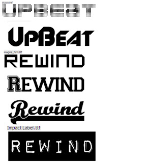
Here are four possible font styles for my headline to my double page spread
These were produced on  www.dafont.com  

Front cover

This was my first idea for the front cover, it is the same kind of title as 'Q' magazine.
 This is the other idea for a front cover which I preferred but move the title behind the main picture.
 I moved the picture in front of the magazines title and added a bar code, date and price. I much prefer the title behind the picture.
 I decided to move the bar code down to the bottom as it's not the main focus. I also added a website address.
I then moved the title of the magazine down a little to make room for another convention to be added which I haven't decided on yet.

This is an even further progressed design with a banner headline and some strap lines at the top of the page.

Here I have added a strap line, a tag line and made a plus sign using the rectangle tool on photoshop and added font I created on http://www.dafont.com/. I'm very happy with this but want to tweak it a little to make it better.

This is an even further progressed draft with a quote and a cover line on an interview. I also added two cover lines in the 'PLUS' section with the main parts highlighted yellow to attract the reader to the cover line. I also changed the font style on photoshop of the main headline because I thought it suited the page better.

In this copy I have added a free gift which can be found inside the magazine to entice this issue to sell even more copies. If a free gift is included this further enhances the idea that the magazine is value for money.

This is the same as the one above but with amended spellings.
In this edit I smudged the edges of the title to give it a more rounded look and more finished off. I did this using photoshop tools like blur and smudge.


This final draft has the word 'CD' added to the puff becasue it make more sense when reading it. I also got rid of the white speckles around the 'PLUS' section by smudging them on photoshop. I have also amended a speeling error I hadn't previously notcied which was the incorrect spellign of 'Gerrard' which should be 'Gerard' this was an obvious change I had to make because the reader cannot relate to the featured artist if they aren't given the correct name. The only other change was that I added my slogan which I had previouosly forgot to include. This was pointed out after showing friends and family my front cover. I changed this due to feedback recieved to add more required conventions to my magazine front cover. The 'FREE' section also has a changed font style and colour which is all in bold to add emphasis to the gift inside.


This improved final draft has a all white cover line from Gerard Mcourt with a white exclamation mark which I had not noticed was pinkuntil I had printed it.

Wednesday, 15 December 2010

Publishing details

My magazine is to be released monthly to allow consumers to get good value for money especially with everyone watching what they spend at the minute with the current recession. However I am aware that parents will always be willing to support their child/children as well as the government providing loans for students attending university or college students receiving EMA. Therefore I feel  £3.50 is reasonable and well worth the money. Everyone, especially teenagers at present like to think they haven't wasted their money and I think £3.50 is money well spent for this monthly magazine which will be a thick magazine containing all the months past events and a website including much more to keep them updated. I will be aware however that not only magazine buyers will access the website and will include quite a bit of magazine only content to make sure they maintain their value for money idea. Also, after researching into existing magazines I think this is reasonable seen as though the Q magazine is £3.99 and KERRANG! is £2.20.


Target Audience


My target audience will be vital in refining my magazines ideas to attract and interest everyone in my targeted audience. The age range my magazine will mostly be aimed at is 15-24 year old's with the main focus of my magazine on male readers. This will be easy to achieve as I am male and know what attracts these readers. This audience is easy to target using VALS (Value life styles) and helps me identify further how to price the magazine and when to release it. My targeted age range is easy to hit because I fit into the category and have a fairly good understanding of what my aged people are interested in and expect from a magazine. The buyers of music magazines always expect to hear about recent issues around the world and like to feel part of the text and story and like to try and relate their real life situations to the people in the magazine. The socio-economic group's I am targeting are C2, D and E. This is because they have a decent income or at least get some form of financial support from parents or guardians. Especially the top end of my age range who have jobs or attend college/university. These students sometimes get EMA or student loans or receive money off parents. Some others however have part or full-time jobs where they earn enough to pay for a magazine if it interests them enough. Therefore with their interest in music at this age being so high they are likely to want to read about their idols in music and relate to them. Phsycographics also play a vital role in determining the target audience of a magazine as they indicate the beliefs of of the consumer and indicate interests within their phsycographics. I want to mainly appeal to the integrated phsycographic group in which they feel they belong to the society they are concious about belonging to and are driven by achieving yet like to express themselves.

Monday, 13 December 2010

Hand drawn possible layouts

 These are three front page layouts I could use and will experiment with my favourites. I prefer the first one at the minute becasue it adds more effect to themain story in my opinion.


Contents page layouts-
These are three possible layout I can use. I prefer the second one as it's more spacious for images and perhaps a puff but I will experiment with a few different layouts.

Font Styles

 These are all possible styles but my favorite for each has to be the rewind one with an arrow gouig backwards and the second one down of UpBeat. I like these two as they would be easily rrecognisable for a magzine and would connotate the magazines perfectly for what they are about.


http://www.dafont.com/

Sunday, 12 December 2010

Photos

 I like this photo and could use it as part of an awards ceremony night since we are dressed for a wedding.
 This is also a quite good image but too far away for a front page image, I may use it for my contents page.
 This photo is ok but I doubt I will use it for my magazine
 I think this could work well for a front page image as it's a close-up image  which shows the two 'artists' to be happy and enjoying themselves.
 This is another good image I have edited and I like the red background but it might be a bit too dark for my front page.
 This is another edited image which is a possibility for my front cover as it shows the models facial expression in detail.
 This is the original image to the one above and was taken in a black and white effect. Again I will consider this for my front cover.
 This is another good image I will consider for my front cover as it is colourful  and a positive image however I will need to edit the background out.
 I really like this image as her eyes look really good and would grab attention on the front page. This is my favourite image so far.
This photo is ok but I don't think I will use it because we are both looking downwards and I am not really smiling which would send out the wrong message to readers.


 This is an original image which I like but at the minute I prefer the black and white version.
This is another image I really like and can be used perfectly for an awards kind of look to the front cover. I will definitely try this for a front cover.

Friday, 10 December 2010

Analysis of magazines

Q Magazine

 Front cover:


Language-  The first thing you see on this front cover is the large long shot image of  'Take that'. The denotation of this image is that they are all piled on top of each other smiling. This gives the reader the impression that they are having fun and making up for lost time now that Robbie Williams has re-joined the group. The connotation of a pile on is that children do it with their friends having fun and messing about and this image suggest 'Take that' will roll back the years now they could be 'back for good' and make up for lost time. This image also shows Take that to be a stereotypical group of lads having fun and enjoying themselves which gives the audience a positive representation of this band. This image has also been edited to a white background or done on a green screen, this was done because it focuses solely on the band without having any distractions in the background. They are all wearing leather jackets, black jeans/trousers and black shoes and are all smiling and look happy. This has been done to show how happy they are to be back together and how together they are by all wearing the same outfit and no one is singled out. The Q masthead is in a standard font you would see in everyday use with no fancy flicks or frills which appeals to it's target market of people passionate about music on the whole. It's also got a plain background and few colours because it's target audience are more interested in content than fancy colours etc. The name of the magazine Q is simple and easy to spot from other magazines, this gives the magazine an instantly recognisable title. The Q masthead is always at the top left of the page  which looks smart and is a key feature of his magazines layout as it allows a lot of room for other content around the masthead. The other main convention used in this front cover are the two strap lines 'Back for good?' and 'A year inside'. This convention gives the readers an instant feel for the stories in the magazine and helps them decide on whether they would be interested in reading the story or not. These are also in bold colours to stand out from the white background but again the fonts used are simple yet effective in drawing in their target market. The sell line for this particular issue is 'The world exclusive' which immediately makes you want to know what it is because it's the only magazine that's been able to get whatever they are advertising as exclusive. This adds to the magazines reputation because no one else has got this interview. The two cover lines used on the front cover are both about a review/interview about two bands. This would appeal to the target audience because their audience is interested in big reviews and interviews about the bands so that they can connect with and understand modern bands and artists. There is also a puff about the Q awards which again contains interviews with all the winners which shows how this magazine has targeted its audience and taken their interests into consideration. The layout of this magazine is such that all the conventions like sell lines, puff, headline, strap line etc are on the outside of the main image to allow the main focus to be on 'Take that' whilst still showing reader's what inside this issue.


Institution- Q magazine launched in 1986 and is now the UK's best selling monthly magazine and has expanded to have it's own t.v and radio show along with its on 'Q awards'. It is produced by the Bauer media company who are globally recognised for their media publications. The Q magazine has no particular audience except music lovers in general who want to read about their passion and hobby. Bauer media also produce the vast selling and well-known Kerrang! magazine.


Ideology & Audience- This magazine shows that it's readers are genuinely interested in all types of music because it contains a wide variety of genres which wouldn't normally be seen together showing that they can tolerate any musical genres. They are able to mix genres because with the genre being so wide open they can throw them all together for passionate music lovers. This target audience has the beliefs that the music you listen to doesn't determine what other interest you have. This helps Bauer media to produce this magazine because they don't have to convey a certain representation of a certain music genre. This front cover mainly promotes pop music with the main image of Take that. This magazine costs £3.99 and is released monthly which indicates the target audience can be anyone with a general interest in music because for a monthly issue with 163 pages and up to date information it is very reasonable as opposed to some prices of magazines.
http://www.bauermedia.co.uk/Brands/Q/


Representation- This featured artist/band is Take that who are globally recognised. On this front cover they are shown to be always up for a laugh and enjoying life. This is connotated by all the band members smiling and taking part in a pile on which shows they are all involved and again reinforcing that they are enjoying life now they are back together as a group. This shows the group in a positive light which helps to promote the band. They are also in leather jackets which suggests that they want to roll back the years from when they first got together and look as young as they feel now they are back together.


Contents page:


Language- This contents page is spread across two pages with a list of 'Featured' content and 'Regular content within the magazine. It splits the magazine up into pieces and makes it easier for the reader's to understand and pick out their favourite parts. This page is laid out in the same way the front cover is. The contents page and front cover both have story strap lines and headlines and information about the magazine and page around the outside of the magazine to keep focus on the centre of the page which is an images/images. The contents page has 8 images which are 6 images which are long shots which could indicate that what the y are doing and where they are is just as important as who they are and 2 medium close-ups which switch the focus to solely on the artist in the story. Notably, all the artists/bands shown in the pictures follow usual stereotypes into their genre of music. This is to keep up audience expectations as well as keeping realism with shots taken from gigs etc to portray how they actually dress. The font style and colours are the same as the front cover being easy to read and simple. This helps in keeping focus on the musical content which it's audience love and not trendy, modern looking fonts and colour schemes. The front cover contains all the same conventions that the front cover does except the Q awards headline is followed by a lead to tempt the reader to read further into the story and find out what happened. All the headlines to the featured and regular stories are in bold to distinguish what the story is called and what it's about. The top of the contents page contains a red strip which displays the name of the page, the issue number and the magazines ident along with a picture of the front cover. This is a very simple layout yet very effective in drawing the reader to the most important parts of the page. This page also contains page numbers as to where the reader can find the picture related story if they like the look of it.


Institution- Q magazine launched in 1986 and is now the UK's best selling monthly magazine and has expanded to have it's own t.v and radio show along with its on 'Q awards'. It is produced by the Bauer media company who are globally recognised for their media publications. The Q magazine has no particular audience except music lovers in general who want to read about their passion and hobby. Bauer media also produce the vast selling and well-known Kerrang! magazine.


Ideology & Audience-  This magazine shows that it's readers are genuinely interested in all types of music because it contains a wide variety of genres which wouldn't normally be seen together showing that they can tolerate any musical genres. They are able to mix genres because with the genre being so wide open they can throw them all together for passionate music lovers. This target audience has the beliefs that the music you listen to doesn't determine what other interest you have. This helps Bauer media to produce this magazine because they don't have to convey a certain representation of a certain music genre.


Representation- This page represents all the genres of music they are promoting by stripping the images back bare to just a blank canvas mostly or showing them performing live to show the reader how these bands actually are and allowing the audience to make their own judgements on them from what they can see. This page is showing music on a whole as a day to day part of life that we are surrounded by because their is someone smoking in a picture and people performing live  whilst others are piling on top of each other. This shows how much variety in music their is and the vast amount of different personalities within music showing it on a whole as diverse a it really is. All the images also show music artists to be happy and having fun as no one is angry in the photos or displaying negative behaviour. These images help the audience relate to these music stars because it shows they are just like me and you (the readers) having fun and enjoying themselves which helps readers understand their hero's in music better and shows they are no different to the readers.


Double page spread:


Language- Two wide shot's are used on one side of this double page article to fill a whole page. This puts emphasis on the band's image and shows us them in a line together in matching colour co-ordinated outfits. The denotation of these images are that the 5 band members are stood in line along a wall on one photo and the other they are jumping down from the wall. The images are joined together on the right hand side of the page by a caption informing the readers what the picture is about and what's going on to keep them involved and updated with the music world as well as telling them who's in the photos and where they are. The left hand side is all an article about Take that re-forming as a band. Again the house style is kept as it is throughout the magazine with it's simple yet effective layout and colour scheme. The black and white text is typical of an article which you read in a newspaper which concentrates on the content of the article by not adding anything fancy to detract attention from the purpose of the text. It contains a headline telling the audience who the article is about and keeps the magazines ident in the top and bottom left of the page. It also has the website address, issue date and page number along the bottom of the page to encourage you to read further into the story and get more information. The text has a capital red 'T' on the page behind the first three paragraphs running through the middle to break the text up a little and add some colour to the page as well as helping to spell out the initials of  Take that with the other black 'T' to start the next part of the interview further into the page. The second 'T' not only helps in making up the initials of the band but also being the first letter of the first word in the new chunk of writing to the right hand side which details the band members thoughts and feelings about the re-union. This page is also laid out with three red arrows (>>>) just above where the website address is given to indicate that after the image on the next page their is more about Take that. This is helpful for readers who may think that was the end of the interview and put the magazine down.This keeps them reading on to hear more about Take that. The only other convention used on this page of the article is a strap line which contains a quote from Gary Barlow (Band member) about the featured interview. This can help the reader summarise a story as they flick through before buying or find out a main part of the story from another perspective. It is also in bold and red to stand out from the other smaller text in black. This puts more emphasis on the strap line which gives the audience a big clue as to what they are about to read and helps them decide whether or not they want to read it.


Institution- Q magazine launched in 1986 and is now the UK's best selling monthly magazine and has expanded to have it's own t.v and radio show along with its on 'Q awards'. It is produced by the Bauer media company who are globally recognised for their media publications. The Q magazine has no particular audience except music lovers in general who want to read about their passion and hobby. Bauer media also produce the vast selling and well-known Kerrang! magazine.


Ideology & Audience-  This magazine shows that it's readers are genuinely interested in all types of music because it contains a wide variety of genres which wouldn't normally be seen together showing that they can tolerate any musical genres. They are able to mix genres because with the genre being so wide open they can throw them all together for passionate music lovers. This target audience has the beliefs that the music you listen to doesn't determine what other interest you have. This helps Bauer media to produce this magazine because they don't have to convey a certain representation of a certain music genre. The audience to this article in particular would be people who enjoy Take that's music and want to know what's going on in regards to their comeback.


Representation- One connotation of this image is that they are just the same as their fans because the band are all on the streets with the rest of the public (shown by two members of the public walking past the photo shoot) walking by as they would anyone else who isn't famous. This shows the band positively and says that they don't think they are above their fans and the readers although they start higher up than the general public they jump down to join in the usual lifestyle of people in London.The bottom photo shows them jumping off the wall again re-enforcing the fact that they feel re-invigorated now they are back together because they are like a gang of kids jumping on and off walls smoking and having a laugh together.The public members walking past in the top image are blurry and out of focus which again emphasises the importance of them getting back together and shows they are icons on and off stage even when walking round the streets.